My Sunrise Bakery and Coffee Shop Journey
Coffee Shop UX/UI Project

The Coffee Shop Project let us use a real case scenario to mock up a rebrand that focused on user center design. We navigated through its strengths and weaknesses as well as its opportunities and threats. With each level of research and analysis, I was able to pin point where Sunrise could grow and become a better business by looking through the customers’ stand point.
Commercial Coffee Competitive Content Audit
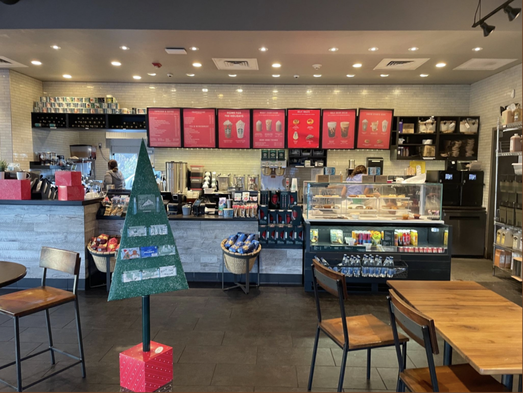
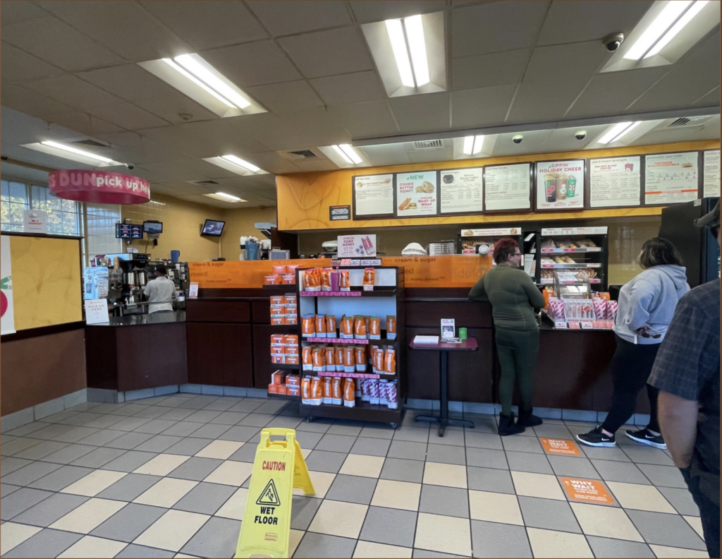
Starbucks and Dunkin’ was how we started off our research into coffee shops. It was really useful to see how a couple of the most popular coffee shops in the country was running and how their shops catered to their customers. From what I saw, Dunkin did a better job at way finding and adding nodes so that their customers instinctively knew what to do and where to go.
Commercial Coffee Competitive Content Analysis
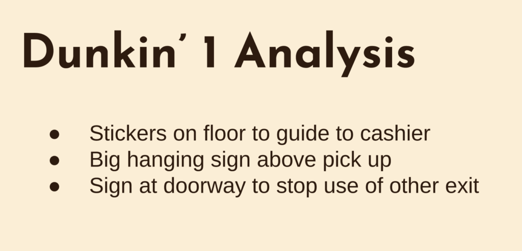
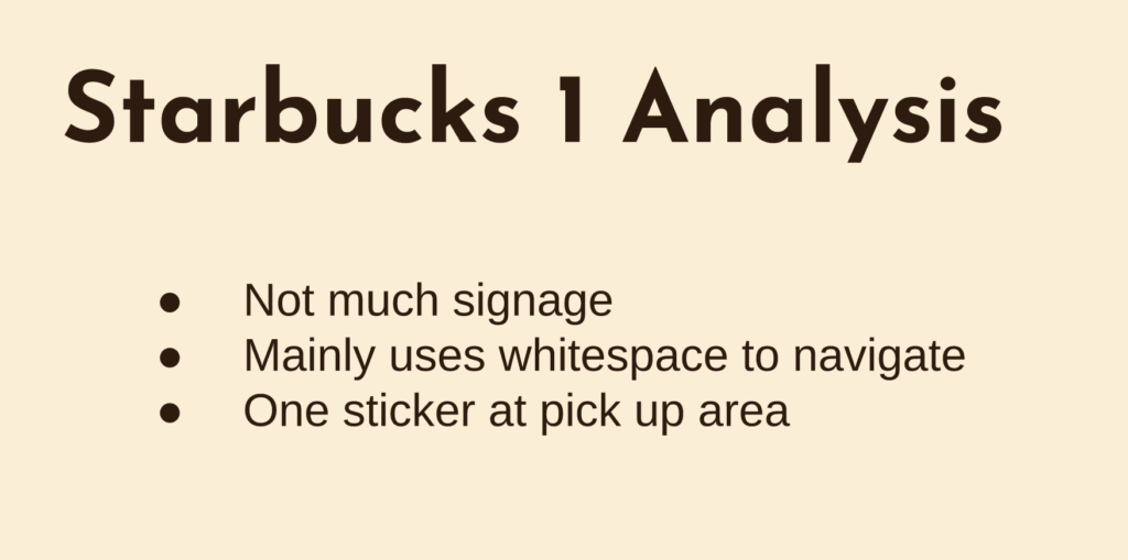
Dunkin’s target person would be a 20-40 year old of any gender. Dunkin’s quality is pretty low, they focus more on conveniences and their vibe is pretty basic, nothing special. Starbucks’ target person is a more upscale coffeeshop with their target persona being a 20-45 year old woman.
Target Coffee Shop Content Audit
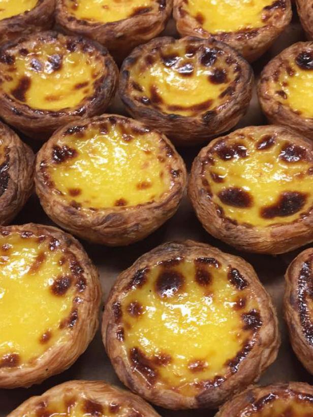
Sunrise’s target persona is a 30-65 year old woman. Their quality is much better than Dunkin’s because it is more fresh. Their current vibe is pretty boring and basic though; Just like any other coffee shop.
Target Persona
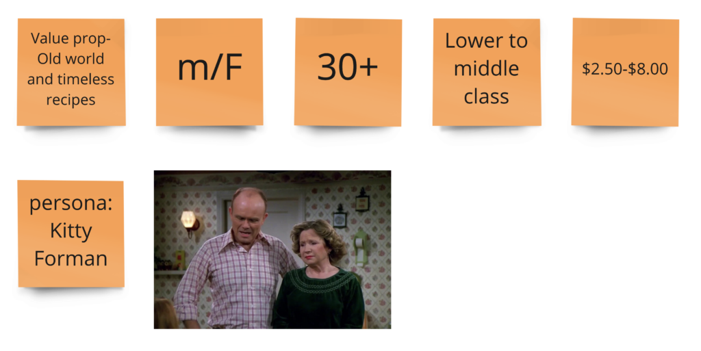
The target person for sunrise is a 30-65 year old woman. They are in the low to middle class. They are also probably looking for something Portuguese on the menu that they know they can’t find at other coffee shops.
Target Whitespace Analysis
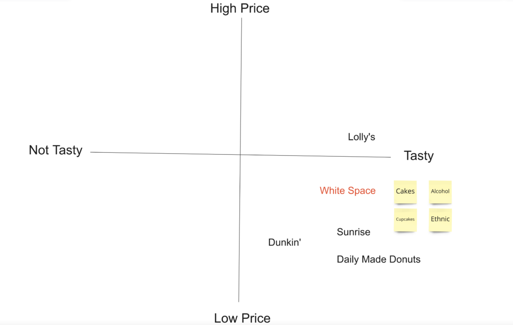
The surrounding coffee shops would be dunkin and daily made donuts who are both quick stops with nothing to special about it as well as lolly’s which is a more sit down type of coffee shop/ breakfast place. All of these places all coffee and breakfast foods. But none of them have the wow factor in their physical spaces that will draw in the customers and make them want to stay.
Target Value Prop Canvas
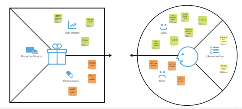
Currently the brand is very uninspired and outdated. A solution would be taking it back to the original owners’ intent of an old world vibe and recipes. That will give a nice balance and unity to the brand the audience and services they offer.
Target Value Prop Analysis
Currently Sunrise has a pretty bad user experience. Mainly due to the layout of the place, and the lack if waypoints and nodes within the coffee shop. Once the renovations are done with the rebrand it will flow much better and customers will be able to navigate their way much easier.
Hierarchical List
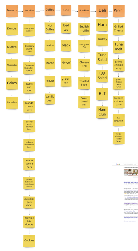
Currently at Sunrise, There is a large variety of products and services that range from typical breakfast and lunch food to their specialities. The categories are coffees, teas, sodas, specialty drinks, sandwiches, desserts, breads, soups, fish. The main category that would draw people in is the variety of Portuguese foods that they offer.
Target Persona Journey Map

Customer would walk in and get in line to order their meal. Once they get to the counter, a staff member will ask them if they’ll be dining in or taking out and what they’d like to order and they’d enter their order into the computer and then ask if that is all that the customer would like. Once the staff member gives the total amount due, the customer would then pay with either cash debit or credit. The customer would then be handed the recipe and their change is necessary and the customer would move in to the next line to wait for their food/ drink to be ready to pick up. If the customer is dining in, they would go to any open table and wait for their order number to be called out.
SWOT Diagram
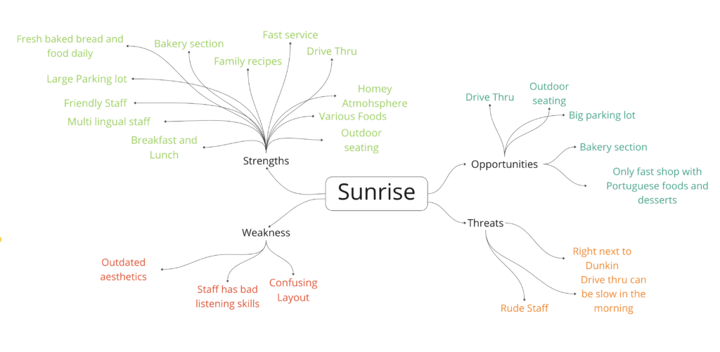
Sunrise’s current weakness and threats stem from 2 main areas within the coffee shop. The first one being the staff’s bad listening skills and poor customer service at times. And the second one is the shops physical space since it has an outdated aesthetics, Confusing layout, and it is right next to Dunkin’.
SWOT Analysis
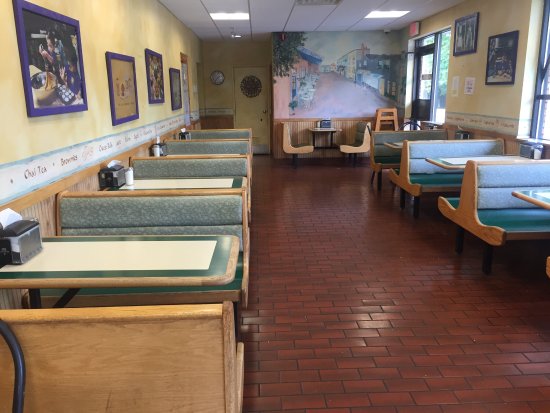
As I looked at the white space in the area of sunrise and its competition I noticed a huge gap in the quality of their physical spaces. With that I mind, I took that as an opportunity to grow market share. With sunrise having its food and drinks already diverse and distinct, all it needed was an inviting, immersive, and functional design and layout to further set itself apart from its competition.
Target Revised Value Proposition
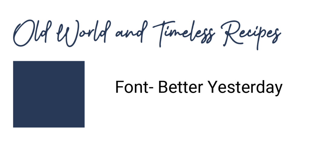
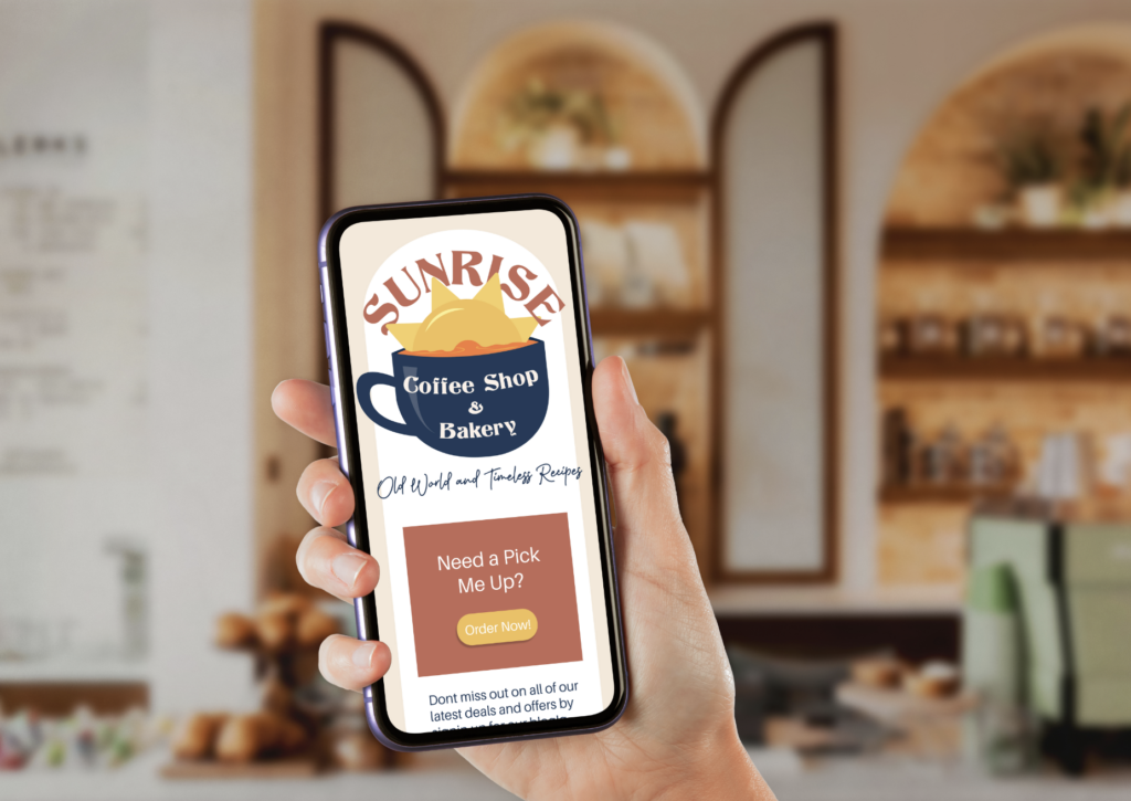
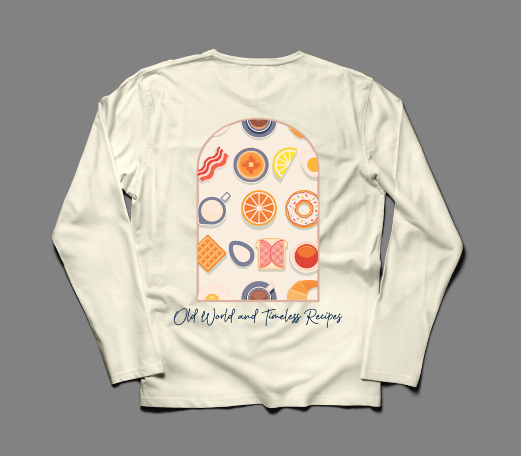
The sunrise value proposition has evolved from a basic one dimensional phrase to a deeper more meaningful phrase that connects the products and services to the new aesthetic and target audience. The first value prop I chose was “wake up with a smile” because of the sunrise name and waking up with the sun. This slowly became “Old world and timeless recipes” because I wanted something that would have an impact on the customers and the fact that they are mostly older people from Portugal they could have a connection with the old world aspect as well as the family recipes that are being served.
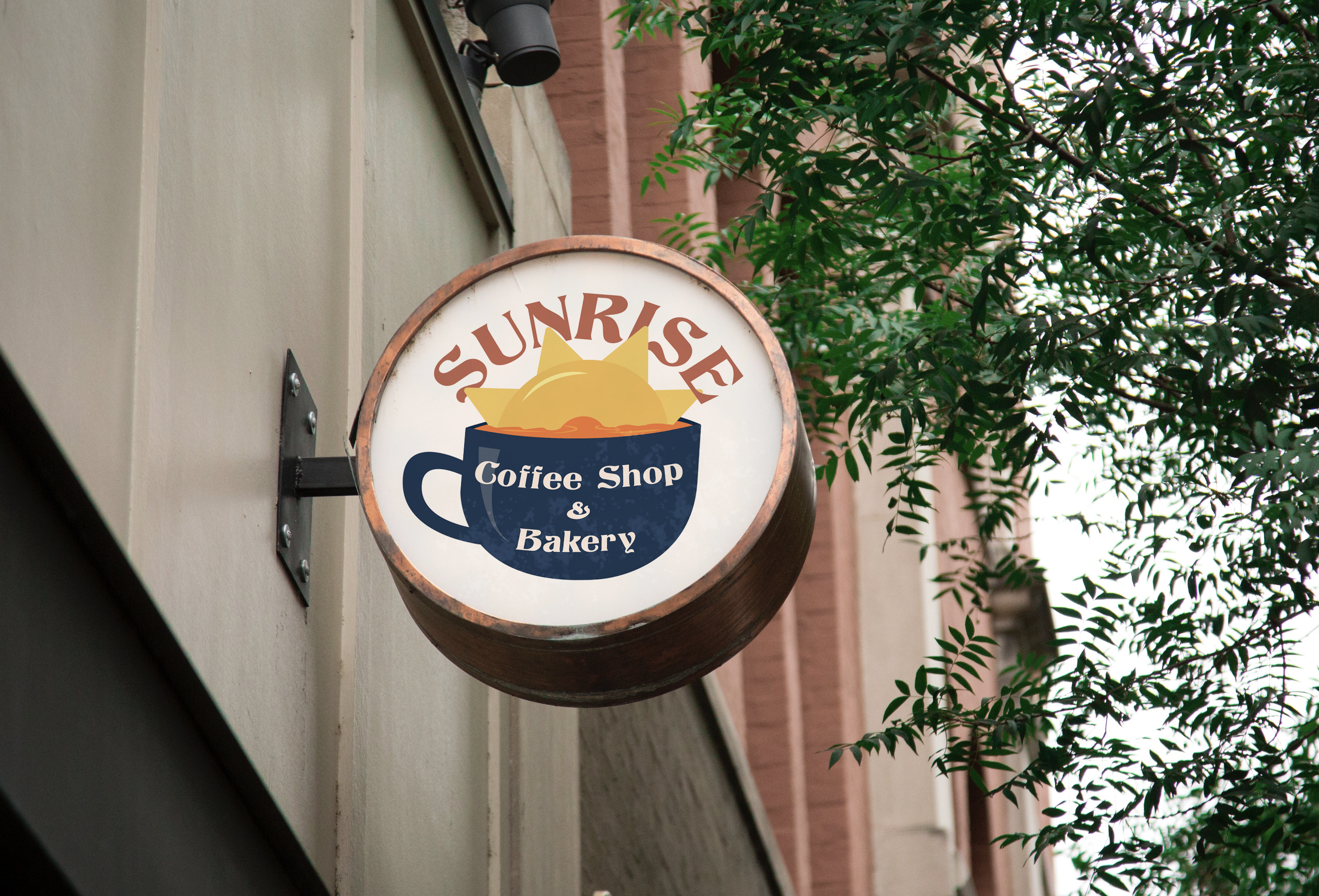
Target Logo Evolutions
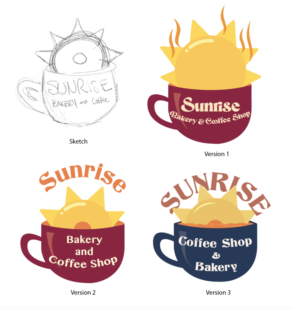
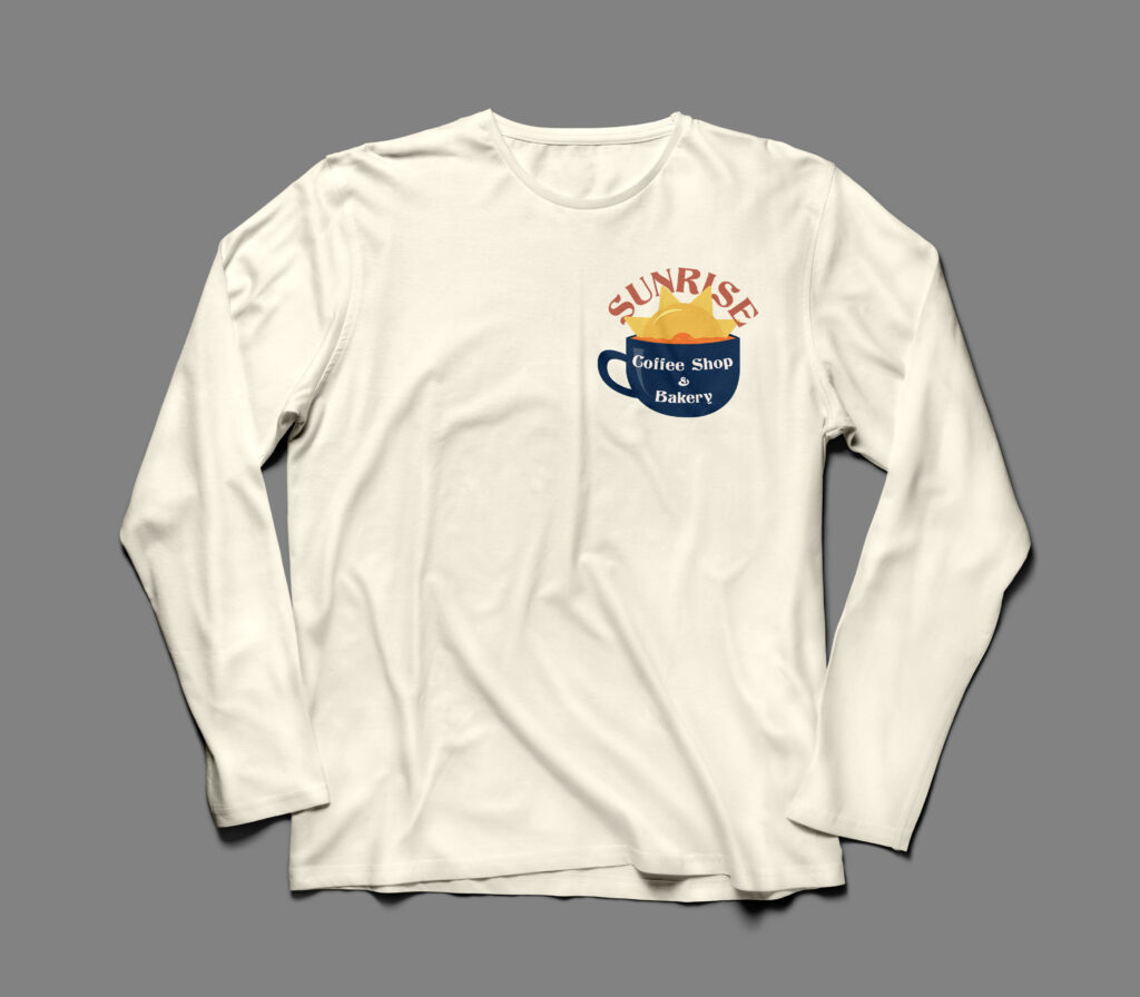
Target Logo Merch
Target Mobile Website Wireframe
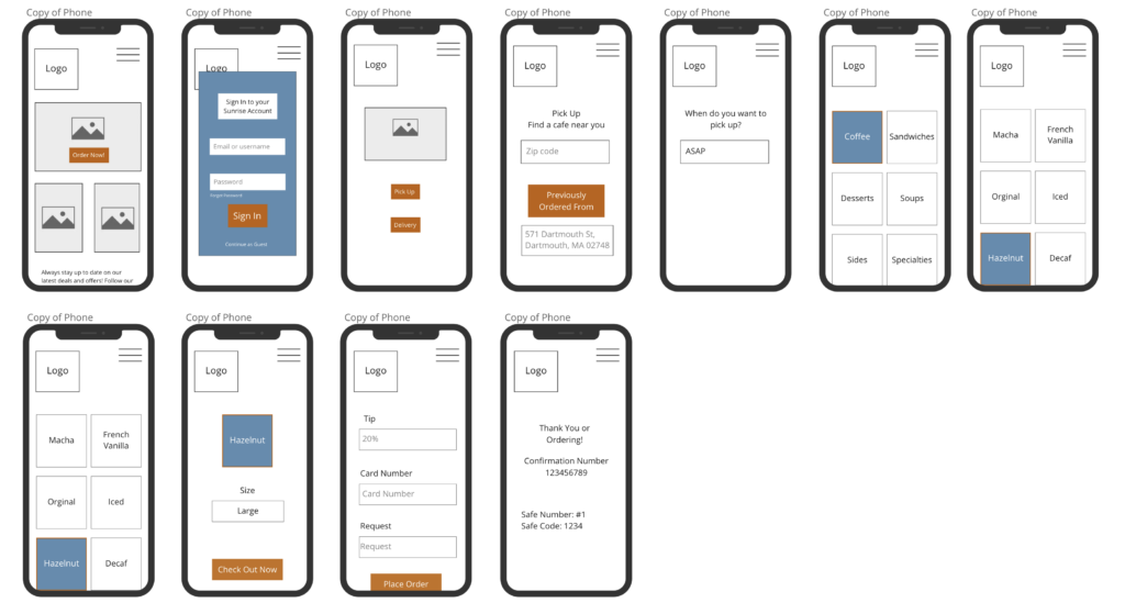
Target Mobile Website Prototype
