Terraforming Mars 3d Magazine Cover

About the Client
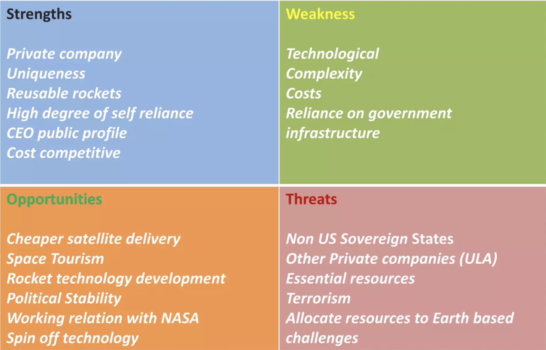
My client for this project was SpaceX. They are in the Space Exploration Technologies industry looking to make advancement in science and space travel. Their target customers are Investors and Space technology developers. They are a 12,000 Employee company and as of 2023, SpaceX operates four launch facilities: Cape Canaveral Space Launch Complex 40 (SLC-40), Vandenberg Space Force Base Space Launch Complex 4E (SLC-4E), Kennedy Space Center Launch Complex 39A (LC-39A), and Brownsville South Texas Launch Site (Starbase).
Their Challenge
An issue or problem that my client wanted me to address was the extreme efforts that would be need for even the possibility of terraforming mars. They are a smaller company and rely heavily on investors and government funds. This has always been their problem. Their expected outcome of this project would be to spread the word and inform people about their efforts and progression in their projects.
My Solution
My response to the challenge was rooted in the research that was conducted by reading various articles, watching documentaries and reading through SpaceX’s website.
Affordances:
- More space for humans
- Multi-planetary Habitation
Limitations
- Expensive
- SpaceX is a reliant on investors
- They are also a relatively young company
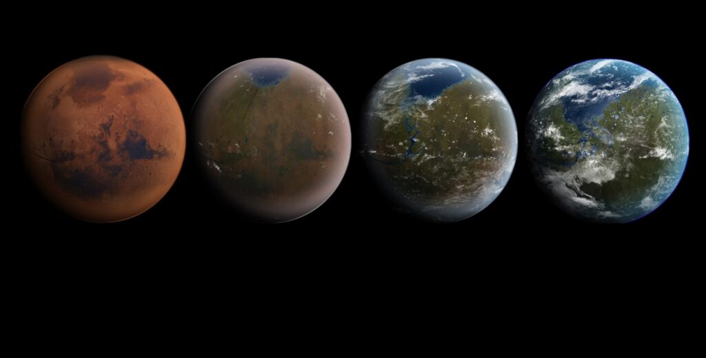
This article will explain whether we should terraform mars or not. The solution was a fully realized depiction of Mars being terraformed as a 3d graphic on a magazine cover. The cover will have a classic but modern sci-fi twist to it in the type face and layout.
Results
The creation of the 3d cover art solved my clients problem in many ways. They saw many benefits from it such a an increase in attention to their articles because of an eye catching cover. This could also lead to more investors for SpaceX. Over time my client should an increase in support in their projects and missions. As well as an increase in investments made to aid these projects. My client would agree that I’ve solved their problem.
Critical Stimulus
Some of the information that was important to understand was:
- Who was the company
- Why did they want to Terraform mars
- How where they planning on doing it
- What did they need to do it
All of these question were imperative to accurately create a cohesive magazine cover that appealed to the right audience.
Paper Prototype
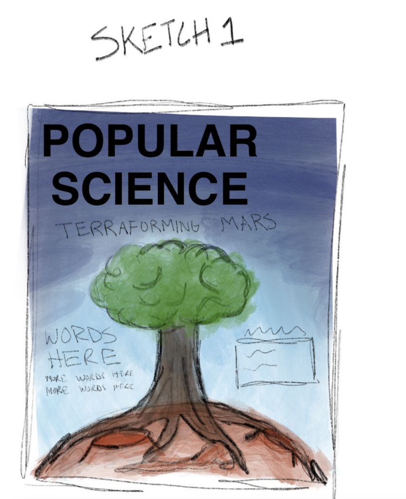
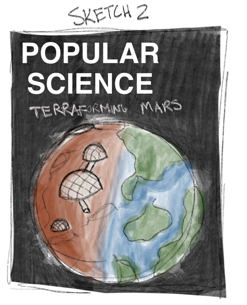
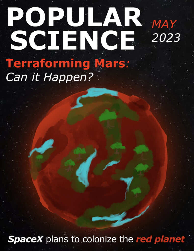
Creating sketches before the final product was a way to test out different versions of how the concept of terraforming mars could be visualized. I used past Popular Science magazine covers as a source of inspiration. This helped make sure that the cover that i created could seamlessly fit in with the current array of covers in Popular Science archive.
Planning and Inspiration
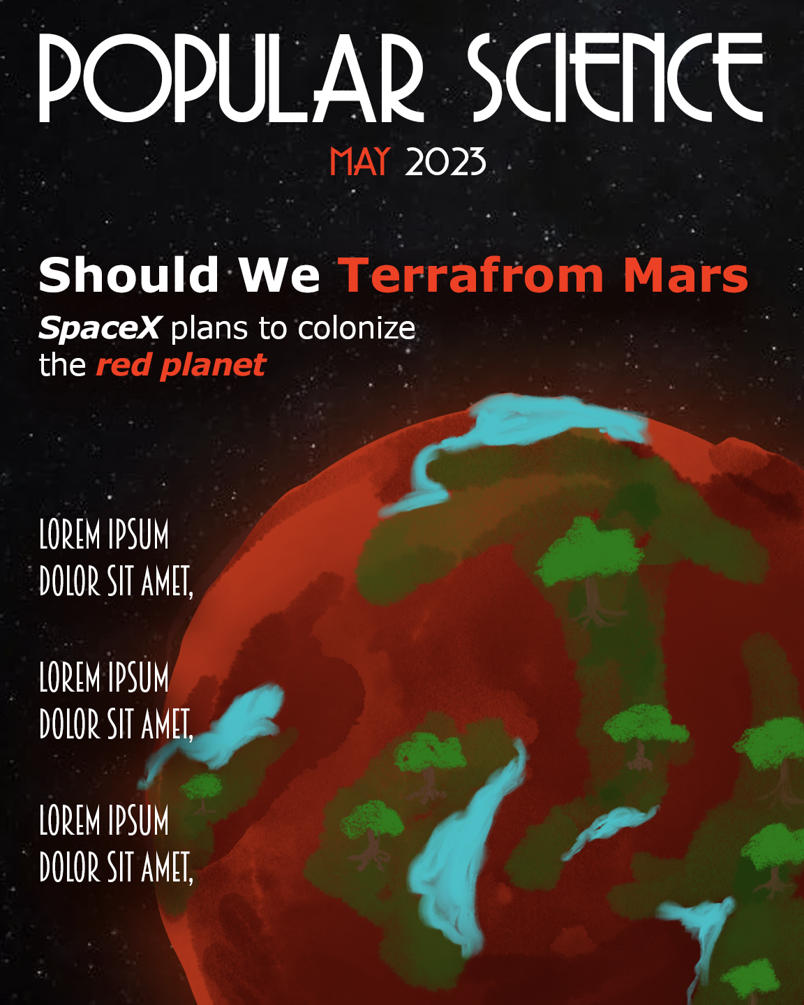
Once I created the sketches, I chose a direction that I wanted to move towards and created a medium fidelity concept piece. This would now contain more accurate color palette, layout, and typography. I wanted to call back to Popular Science’s long history of published magazines and used a retro font called Copasetic. The color palette stemmed from the red planet its self and vast dark space that surround it.
I knew for the 3d aspect of the cover I wanted a low-poly version of Mars with trees and water covering parts of it so I began to look for inspiration for the visual style.
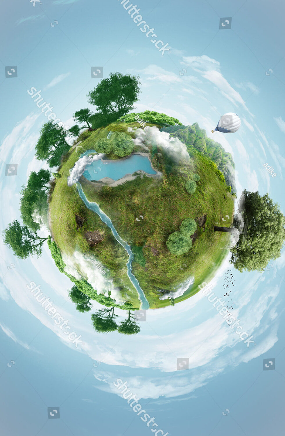
Creating 3d Art
For this project I created a 3d asset to be the focus of the magazine cover using a program called Cinema 4D. With no previous knowledge of using this, it was a learning experience to create metaphorical version of Mars being terraformed. With my sketches as a guide I began to create the object.
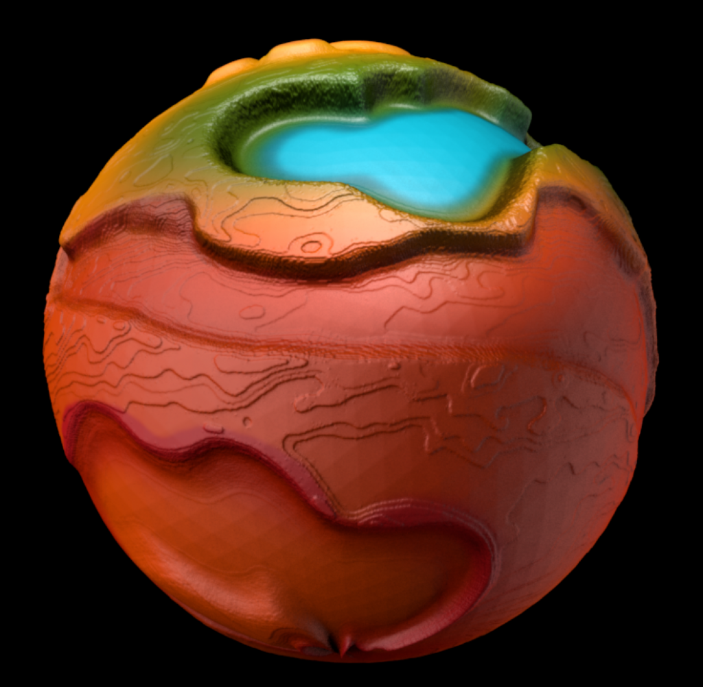
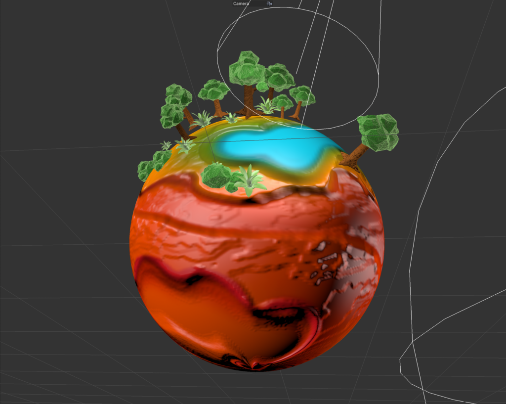
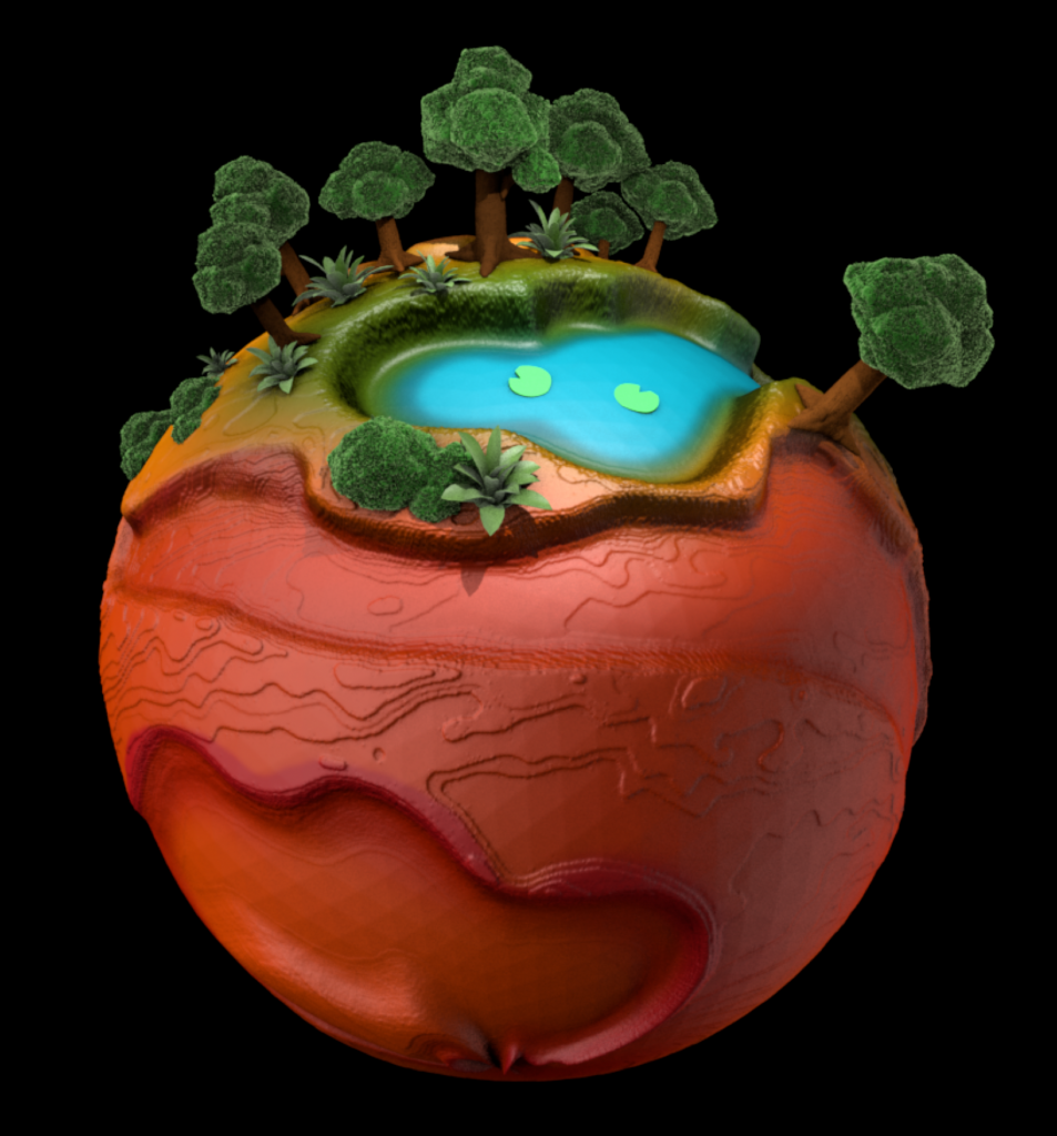
To create the look I wanted. I needed to add a custom displacement map to a sphere. This would create the elevations and craters in the sphere to resemble a Martian landscape. This was a challenge because it is hard to intentionally and mindfully create something random where the low points and high points would be. Once that was completed I then added a custom painted image to create the color of the planet and add the blue for the water. I used the displacement map as a guide to accurately paint within the different elevations on the sphere.
The Journey


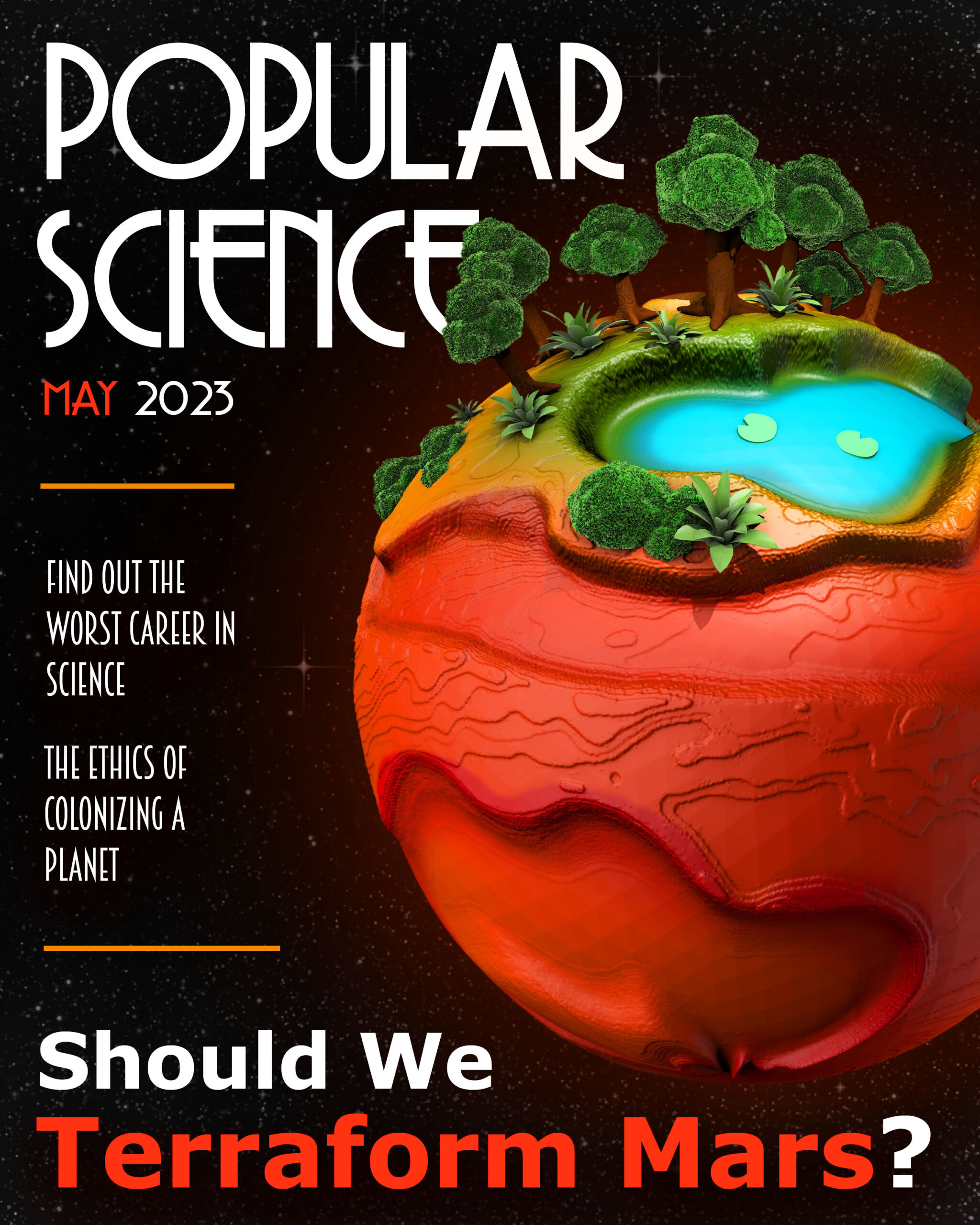
For the final design I added the Cinema 4D creation to the magazine. I intentionally had the trees cover a bit of the title to add depth to the cover. I also added a little glow to the planet to further add dimension and interest. I think that the red glow also makes the green trees pop due to the complimentary colors.
